Hays Recruitment
Rebuilding the design system using atomic methodology, evolving legacy components into scalable, tokenised versions in Figma.
Project Highlights

Platform
Desktop & Mobile Responsive


Timescales
9 Months

Role
Lead DS Designer

Industry
Recruitment

Company background
Hays plc is a leading global specialist recruitment company, operating across more than 30 countries and placing professionals into permanent, temporary, and contract roles across a broad range of industries. With a strong presence in sectors such as finance, technology, construction, and life sciences, Hays connects organisations with highly skilled talent while supporting individuals in advancing their careers.
The business operates at significant scale, managing a large network of candidates, job opportunities, and employer relationships worldwide. Its services span the full recruitment lifecycle, from sourcing and screening to placement and workforce solutions, enabling organisations to access talent efficiently in competitive markets.
With decades of industry experience, Hays has built a strong reputation for expertise, market insight, and global reach, positioning itself as a trusted partner for both employers and job seekers.
Team structure
At the point I joined the project, the team was structured as follows:
- Lead UI/UX Designer (myself) – leading the overall design direction, defining the UX strategy, and overseeing end-to-end delivery.
- UX/UI Designer (Junior) – a skilled and detail-oriented designer supporting the execution and refinement of component design.
- UX Design Manager – providing oversight, ensuring alignment, and supporting stakeholder engagement.
- CMS Editor / Specialist – responsible for content structure, CMS management, and implementation support.
- Development Manager – leading the front-end team responsible for building and implementing components
The Challenge
Hays’ global digital ecosystem had evolved in a highly decentralised way, with each country managing its own site structure, layouts, and information architecture through local content and CMS teams. While this enabled regional flexibility, it resulted in a fragmented and inconsistent user experience across markets.
Following a major brand and digital transformation, several structural and operational challenges became evident:
- Each regional site had its own layout, page structure, and information architecture
- Content was managed independently by local editors and CMS authors
- No consistent global standard for UX patterns or page composition
- UI updates were inefficient and manual
- Even simple changes (e.g. updating a primary colour) required implementation across every individual site
- High risk of inconsistency and increased operational overhead
- The underlying CMS and codebase lacked scalability
- Code was not easily accessible or maintainable due to legacy build-up over time
- Limited ability to implement changes quickly or consistently
- No unified design system existed
- Regions relied on locally created components and patterns
- Resulted in inconsistent UI, interaction patterns, and brand experience.
- Design components were not accessible & dark mode did not exist.
These challenges negatively impacted both the user experience and the organisation’s ability to scale and evolve its digital platforms efficiently.
Solution
The solution centred on building a scalable, atomic design system that would serve as a single source of truth across design, development, and content teams replacing years of fragmented components and inconsistent patterns with a unified, living foundation.
Design system architecture
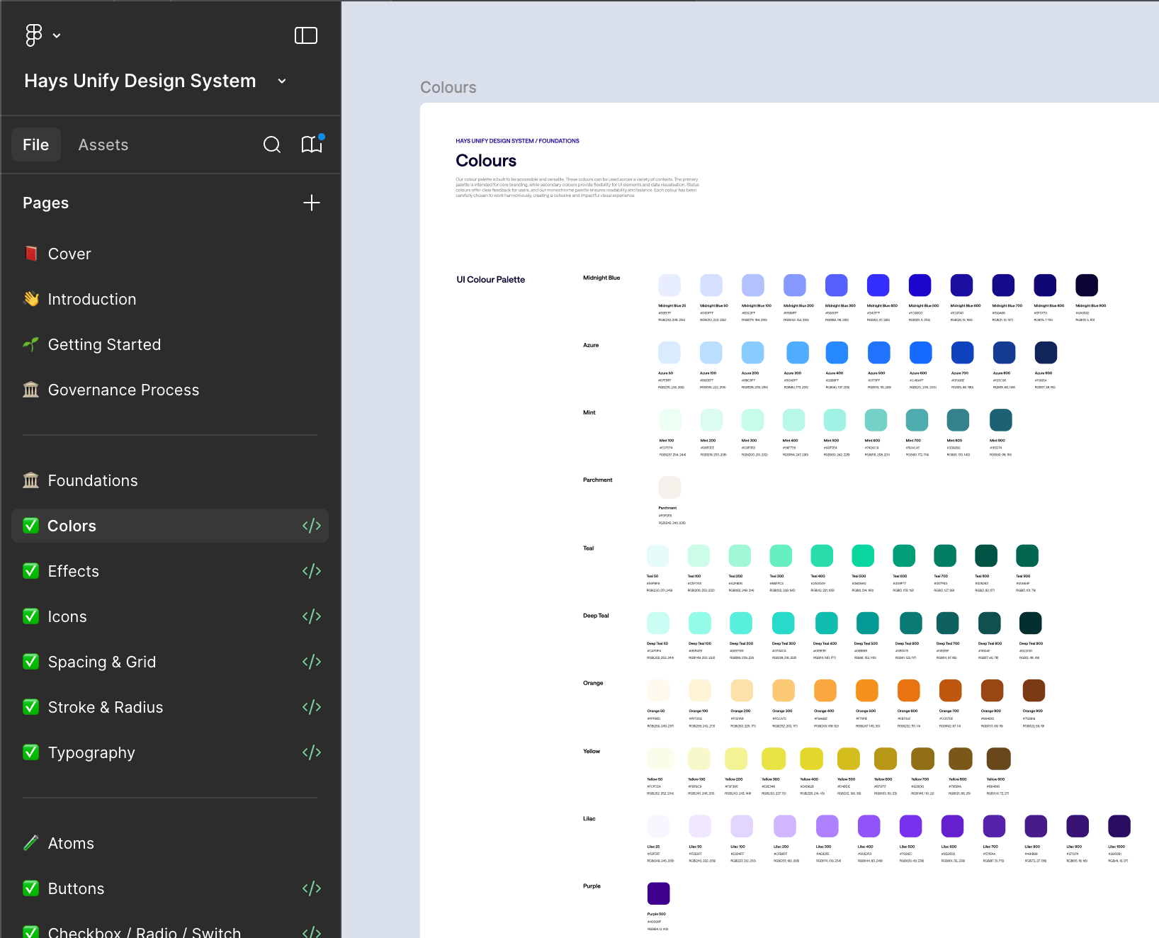
The system was structured using atomic design methodology, breaking the interface down into tokens, atoms, molecules, organisms, and page templates. This gave the team a shared language and ensured every component could be reused, extended, and maintained without duplicating effort. Design tokens were implemented at the foundation layer, meaning global updates to colour, typography, or spacing could propagate across the entire system from a single point of change.
From Instances to Variables
A key lesson carried forward from Hays' previous brand transformation was the cost of not having a variable-driven system in place. Without it, every component had to be updated individually — a process that was time-consuming, error-prone, and difficult to manage at scale.
To solve this, variables were introduced across all design properties: colour, typography, spacing, padding, borders, and strokes. Rather than hardcoding values into individual components, every decision was now referenced from a single source. The practical effect was significant — any future brand transformation could be executed centrally, with changes cascading automatically across the entire system rather than requiring component-by-component intervention.
What once created complexity and inconsistency became a controlled, repeatable process.
Component design
Every UI component was designed across its full range of interaction states — default, hover, active, error, and disabled — with accessibility and responsiveness built in from the start. Components were validated against WCAG guidelines and tested at multiple breakpoints to ensure they held up across devices. Each component was accompanied by detailed documentation covering usage guidelines, content rules, and behavioural notes, reducing ambiguity during handoff.
Page and template structure
Pages were assembled from reusable sections and panels, giving CMS editors a structured but flexible toolkit to build and manage content without breaking the design language. Sections were designed to accommodate a variety of content configurations — from editorial to promotional to navigational — while maintaining visual coherence across the platform.
Collaboration and handoff
Close collaboration with the engineering team was embedded throughout. Figma was used as the cloud-based library, keeping design accessible and version-controlled. Components were annotated with precise specs, interaction patterns, and developer notes, enabling accurate, efficient implementation and reducing the back-and-forth typically lost between design and build.
Impact
The Hays design system delivered measurable improvements across design velocity, development efficiency and platform consistency. By creating a unified, token-based system of reusable components, documented patterns and CMS-ready sections, the solution enabled Hays to scale its digital experience across markets and teams with significantly less manual effort and operational overhead.
↓ 60% reduction in design time per new page or journey Design time reduced from 5 days to 2 days, as designers could assemble new journeys from existing components rather than designing each experience from scratch. This accelerated delivery while creating a more consistent design language across desktop and mobile responsive experiences.
↓ 50% reduction in development build time per component Development build time reduced from 3 days to 1.5 days, supported by clearer component specifications, reusable design tokens and more structured design-to-development documentation. Developers had a more reliable reference point, which helped speed up implementation and reduce ambiguity during handoff.
↓ 67% reduction in design-to-development discrepancies The discrepancy rate reduced from 30% to 10% by establishing a single source of truth for components, states, spacing, typography and token usage. This helped eliminate inconsistencies that had accumulated across markets and teams over time, while improving the quality and consistency of final delivery.
↑ 50% increase in component reuse across the platform Component reuse increased from 25% to 75%, allowing teams to build new pages and journeys from a shared pattern library instead of creating one-off solutions. This improved consistency at scale and gave Hays a stronger foundation for future digital growth.
↓ 60% reduction in CMS page creation time for content editors CMS page creation time reduced from 2 weeks to 4 days, as content teams gained access to a reliable set of reusable, structured page sections. Editors could build and manage pages more confidently without needing design input for every update, freeing the design team to focus on higher-value product and experience challenges.
6 teams onboarded to the design system Adoption grew from 0 teams to 6 teams, establishing a shared governance model, pattern language and delivery standard across the organisation. This reduced onboarding time for new designers and created a scalable framework for future product areas, markets and responsive digital experiences.
Arash Hamdami